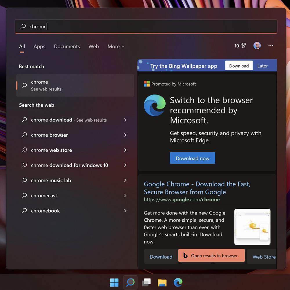
The Windows 11 Start Menu is once again drawing flak from users, this time from a former Microsoft employee. Jensen Harris, who worked at the company for 16 years, slammed the Redmond company for ruining the Windows 11 Start Menu’s design.

He posted a series of tweets to share his opinions about his experience with Windows 11. He termed the Start Menu as the flagship user experience, and says that he was shocked by its design in the latest OS.
Image courtesy: Jensen Harris
Former Microsoft employee criticizes Windows 11’s Start Menu design
Microsoft recommends Edge as the default browser wherever possible, even going as far as to changing the default browser a bit complicated. This is something that has been widely criticized among users, the tech community, and even other browser makers. These ads extend to the Start Menu of the operating system. Harris compared the Edge recommendation in the right panel of the Start Menu’s Search interface to the Internet Explorer toolbars from the 2000s.
He said that the Bing Wallpaper app ad at the top of the search result looks like banner ads from the Geocities-era. The ex-Microsoft employee seemed to have been equally appalled by the inconsistent design principles in the UI, particularly mentioning the corners of the ads and buttons, one of which was rounded, another one has a square edge, while a third has a squircle design. That’s kind of ironic considering that the rounded corner design was touted by Microsoft as one of Windows 11‘s design standards.
Harris also questioned the company’s intentions about placing ads in the Start Menu, asking whether the amount of money that the wallpaper app makes is worth “cheapening” the user experience. The former Microsoft engineer also criticized the migration of the Start button to the center of the taskbar.
Harris was the Director of Program Management for the Windows User Experience. So one can imagine he has a lot of insight about the GUI. He recalled the time when Microsoft once prioritized the design of the Start Menu, explaining how his team had created a special ligature for the font used in Windows (Segoe UI). They had to work on aligning the S and t in Start together. But that is no longer the case. Harris highlighted the importance of the UI, while mentioning that many designers whom he worked with are still at Microsoft. The talent is there, but it doesn’t seem to be utilized correctly.
I think he is spot on with his arguments, the Start Menu is after all one of the most used features in the OS. But it is barely recognizable if you’re coming from an older version of Windows, which in turn ruins the user experience. There are of course other issues in Windows 11, such as the lack of an option to move the Taskbar to the top or the sides of the screen, Taskbar right-click menu, etc.
Users have complained about the Start Menu in Windows 11 ever since the first preview version of the OS was released, but when a person who was formerly in charge of software design at Microsoft gives their opinion about the UI, it hits on a different level. It clearly shows that the company is not focusing on the user experience.
Thank you for being a Ghacks reader. The post Former Microsoft employee slams Windows 11's Start Menu design appeared first on gHacks Technology News.
